
Image Optimization for WordPress: WebP, Lazy Loading & Sizing
Images are usually the heaviest thing on a WordPress page. Learn how WebP, correct sizing, and lazy loading dramatically cut load times without losing quality.
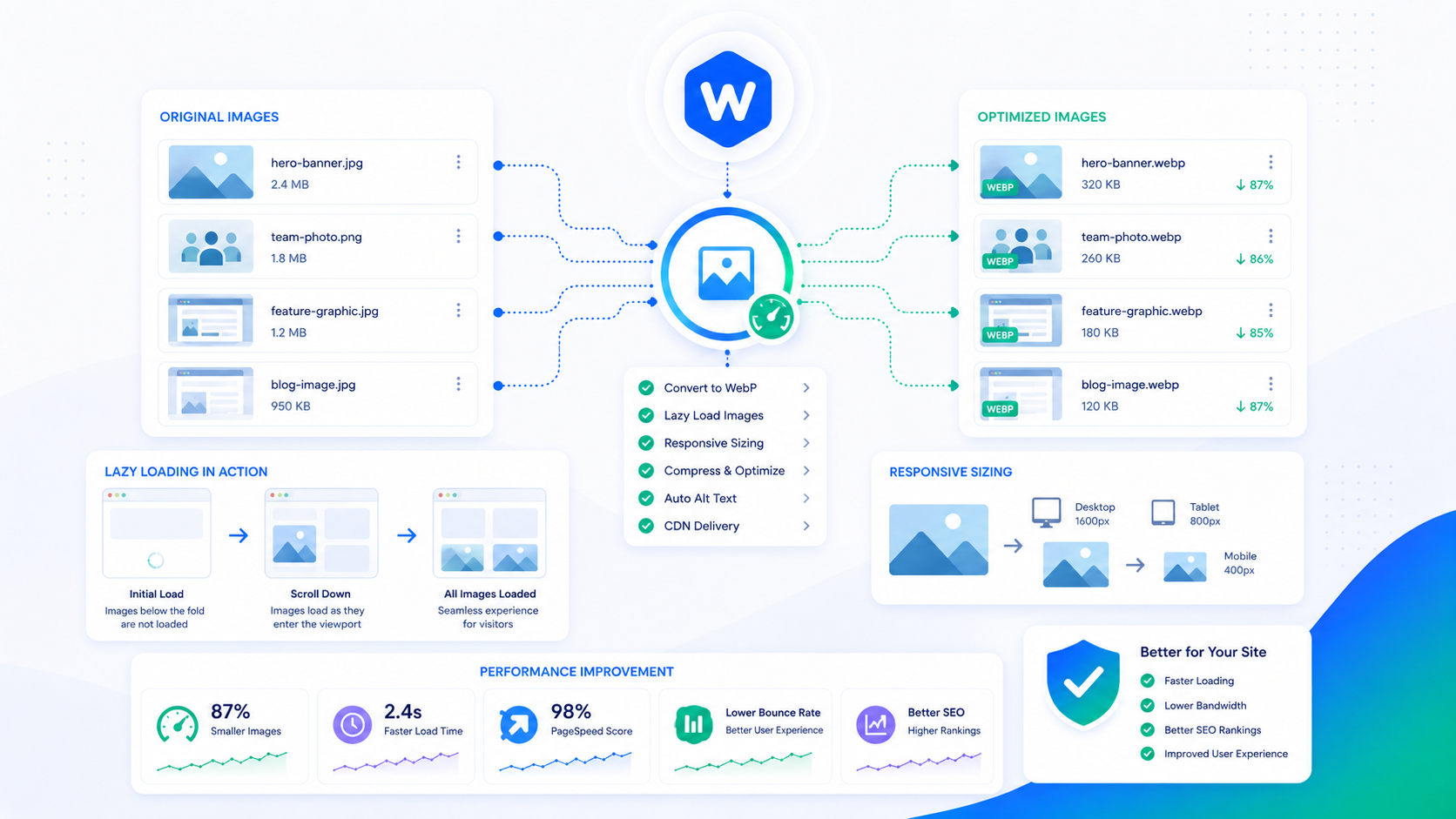
Images are typically the largest contributors to page weight on a WordPress site — and the most fixable. Unlike server performance or render-blocking JavaScript, image optimization is largely a one-time setup: get the format, sizing, and loading behavior correct, and every image uploaded afterward follows the same pipeline.
The performance upside is real. A page that went from 2.8MB to 800KB of image data by switching to WebP and serving correctly sized images is not an unusual outcome. That reduction directly improves load time, LCP scores, and bandwidth costs.
Why images dominate page weight
HTTP Archive data consistently shows images accounting for 50–60% of the total bytes transferred on an average webpage. The gap between “what was uploaded” and “what visitors actually need” on most WordPress sites is large:
- A photo uploaded from a digital camera at 6000×4000px, displayed in an 800×600px container
- A JPEG saved at 95% quality when 80% would be visually indistinguishable and 40% smaller
- Multiple images loading at full resolution on mobile, where a smaller version would be perfectly adequate
- Images below the fold loading before the visitor has scrolled anywhere near them
None of this is intentional — it’s the result of a default upload flow that doesn’t optimize for web delivery. The fixes are mostly configuration, not ongoing manual work.
Modern formats: WebP and AVIF
JPEG and PNG have been the web’s image formats for decades. Both are well-supported and broadly understood. Both are also significantly larger than modern alternatives for equivalent visual quality.
WebP is Google’s open image format, now supported by all modern browsers. WebP typically produces files 25–35% smaller than equivalent JPEG at the same visual quality. For PNG images with transparency, WebP can be 25–50% smaller. The format supports both lossy and lossless compression, as well as transparency (unlike standard JPEG).
Browser support for WebP is effectively universal as of 2024. The only remaining consideration is very old browser versions — if your analytics show a meaningful share of IE11 or very old Safari, serve WebP with a JPEG/PNG fallback using the <picture> element:
<picture>
  <source srcset="image.webp" type="image/webp">
  <img src="image.jpg" alt="Description" width="800" height="600">
</picture>
AVIF is the next generation beyond WebP — typically 30–50% smaller than equivalent WebP. Browser support is growing (Chrome, Firefox, Safari all support it) but lags WebP. It’s worth implementing if your optimization plugin supports it, with WebP as the fallback.
WordPress generates WebP versions of uploaded images automatically as of version 5.8. If you’re on an older WordPress version or if your setup doesn’t generate WebP, an image optimization plugin handles the conversion.
Serving the right size: srcset and responsive images
WordPress generates multiple sizes of each uploaded image and builds a srcset attribute automatically — this tells the browser which image size to load based on the viewport width. A phone loading a 375px-wide page gets a smaller image; a desktop gets a larger one.
This system works correctly when:
- Your theme registers image sizes that match how images are displayed on the frontend
- You’re using WordPress’s built-in
wp_get_attachment_image()function or its theme template equivalents - You haven’t overridden or bypassed the standard image handling
It breaks when:
- Images are hardcoded in templates with fixed URLs instead of using WordPress functions
- A page builder inserts images with its own markup that doesn’t use WordPress’s srcset
- The theme registers a single large image size and uses it for all contexts
Auditing how your images are served is worthwhile. In Chrome DevTools, the Network tab shows the actual image URLs being loaded. If large images are being served to mobile viewports, the srcset isn’t working correctly.
The general principle: don’t upload images larger than you’ll ever display them. If the largest display size for a hero image is 1440px wide, there’s no reason to keep a 6000px source in your media library. Uploading at 2× the maximum display size (for high-DPI screens) is a reasonable upper bound.
Compression: lossy vs. lossless
Image compression reduces file size by either discarding data (lossy) or encoding existing data more efficiently (lossless).
Lossy compression (relevant for JPEG and lossy WebP) discards image data that’s less visible to the human eye. The “quality” setting controls how aggressively data is discarded. Quality 80–85 for JPEG is generally indistinguishable from 95 at a glance while being 30–40% smaller. Anything below 70 typically shows visible compression artifacts.
Lossless compression (relevant for PNG and lossless WebP) reduces file size without discarding any image data. Lossless compression ratios are smaller than lossy — typically 10–30% — but the output is pixel-identical to the source.
For photographic content: use lossy WebP at quality 80–85. For screenshots, diagrams, and images with sharp edges or text: use lossless WebP or PNG.
One critical exception: don’t aggressively compress the LCP image. The Largest Contentful Paint element — typically your hero image — is the most visually prominent thing on the page at the moment it loads. Compression artifacts on that image are immediately visible. Optimize it for format and correct sizing before reducing quality.
Lazy loading done correctly
Lazy loading defers the download of images that are outside the current viewport until the visitor scrolls toward them. WordPress adds loading="lazy" to images automatically as of version 5.5.
Lazy loading is almost universally beneficial — it eliminates downloaded images that a visitor never sees on a given page load — with one important exception.
Never lazy-load the LCP image. The LCP image is the most important element to render quickly. loading="lazy" tells the browser to deprioritize its download, which directly pushes out your LCP score. The LCP image needs to do the opposite — load as early and as fast as possible.
For the LCP image (typically the hero image, featured image, or first large image visible on load), use:
<img src="hero.webp" alt="Description" width="1200" height="600"
     loading="eager" fetchpriority="high">
loading="eager" overrides any lazy-loading behavior. fetchpriority="high" tells the browser to prioritize this image’s download over other resources during the initial page load — a meaningful LCP improvement on pages with many competing resources.
For all other images on the page — anything below the fold, gallery images, thumbnail grids — loading="lazy" is correct.
YouTube embeds and iframes can also be lazy-loaded with loading="lazy" on the iframe element, or using a facade pattern (a thumbnail image that loads the actual embed on click) for even greater initial load weight reduction.
Avoiding layout shift (CLS) from images
A common CLS (Cumulative Layout Shift) source is images without explicit width and height attributes. When the browser doesn’t know the image dimensions before it loads, it doesn’t reserve space. When the image loads, it pushes other content down, causing a visible and jarring layout shift.
WordPress automatically adds width and height attributes to images inserted through the media library as of version 5.5. The fix for older content or custom image implementations is to add these attributes explicitly:
<img src="image.webp" alt="Description" width="800" height="600" loading="lazy">
The width and height don’t have to match the exact display size — they just need to establish the correct aspect ratio so the browser reserves the right proportional space. CSS can scale the image to any display size while the placeholder space prevents layout shift.
If your theme or page builder inserts images without these attributes, or if you’re importing images programmatically, this is the most common CLS fix for image-heavy sites.
Automating the pipeline
Manual image optimization doesn’t scale. Once you have the formats, sizing, and loading behavior set correctly at the infrastructure level, every image uploaded afterward should go through the same pipeline automatically.
The Wordimatic Image Optimizer converts uploads to WebP, applies quality settings, generates appropriate size variants, and sets the correct attributes — without requiring per-image manual work. For existing media libraries with unoptimized images, it includes a bulk conversion tool.
The goal is to set the pipeline once and have it apply consistently. Individual optimization decisions are error-prone and don’t keep pace with a publishing schedule.